Home Assistant is a really versatile smart home system that allows you to connect all your smart home devices. But to control them, or to get insight into your smart home, you probably want to great a Home Assistant Dashboard.
This is the 3rd article in a mini-series about creating my Smart Home dashboard with Home Assistant. In the first article, I explained how we can use and mount a FireHD tablet as a smart home dashboard. In the second article, we divide into setting up Home Assistant and MQTT. And in this article, we are going to create a Home Assistant Dashboard.
It’s good to know that I am using Homey as my Smart Home controller. Home Assistant is only used to display the interactive dashboard. For the dashboard, it doesn’t matter if HA is your controller or Homey.
Good to know
I am not a Home Assistant expert, I have seen dashboards that have really advanced (and nice) features, but are also complicated to make. My goal for this dashboard was to get insight into my smart home and allow my family members to easily change scenes in the house.
Home Assistant is configured in Yaml files, I have written pretty much everything into the ui-lovelace.yaml file to keep things clear and easy to follow. But it is better to separate it more into separate files with larger configurations.
With HA you can’t simply copy and paste configurations from other users. You really need to write your own configuration files for your environment. In this article, I will try to explain how buttons, functions, and layouts are created and how they interact. So that you can create them for your smart home devices.
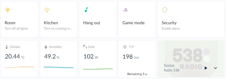
I don’t have created any automations or scripts because Homey does pretty much everything automatically. We only need to turn the lights off at night with a single press on the button. But sometimes you want to switch lighting scenes, turning the lights a bit brighter when playing a board game for example, so this is where the tablet comes in.
Linking Homey to Home Assistant
I have linked Homey with Home Assistant through MQTT. This way all devices that I have in Homey are also available as entities in HA. I have created trigger variables in Homey with the help of the app Better Logic (Homey app).
These triggers can then be added as a button (device) in Homey, which is then available in HA as an entity. The button can start a flow in Homey, so this way we can start flows in Homey through Home Assistant.
Creating a Home Assistant Dashboard
I am going to take you step-by-step through the process of making the dashboard. If you have any questions, just drop a comment below. The layout and style of the dashboard are based on the design of Dejan Markovic.
We are going to use different Home Assistant plugins. I will name them where necessary again, but make sure you have installed the following plugins:
- Weather Card
- Button-Card
- Config Template Card
- Mini Media Player
- Mini Graph Card
- Kiosk Mode
- Button Text Card
- Card Mod
- Layout Card
- State Switch
- Atomic Calendar Revive
It’s easiest to install the plugins through HACS (Home Assistant Community Store). So make sure you have installed this in your HA installation.
Creating the dashboard Grid
The first step is to create the grid of the dashboard. The grid determines where we can place the different buttons, charts, and other content on our home assistant dashboard. To create our custom grid we are going to need Layout-Card plugin.
Follow the installation instruction to install the plugin into your HA installation. I recommend that you use HACS for this.
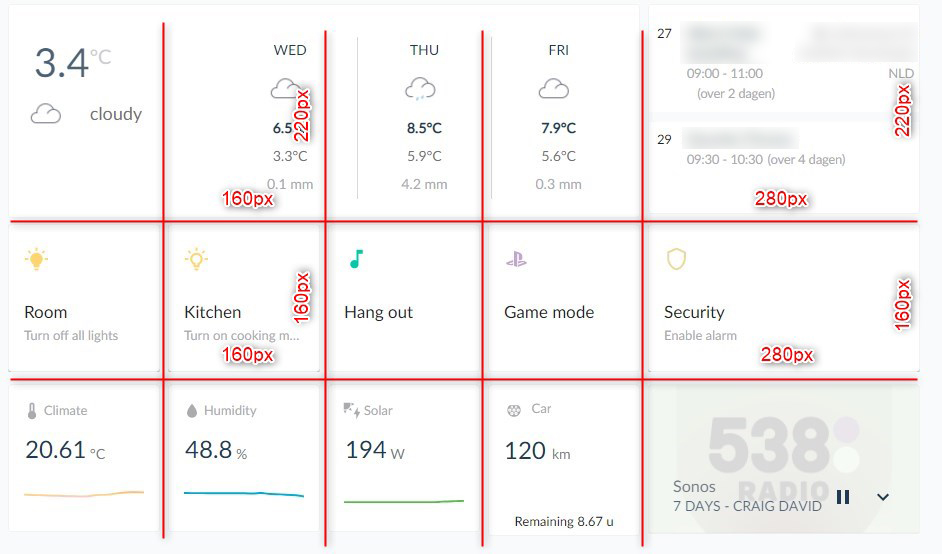
I have created a grid of 5 columns and 3 rows. The basis is a cell of 160px width and 160px height. Only the first row is higher and the last column is wider than there rest.
Open your ui-lovelace.yaml file, using the file editor in Home Assistant (see step 2 in this article) or directly through FTP.
We have our main view defined: home and set the type of the first card to the custom:grid-layout plugin.
# Background color
background: rgb(248,250,251)

# Views
views:
  - title: Home
    id: home
    type: 'custom:grid-layout'
    layout:
      max_cols: 5
      # Define the width of the columns
      grid-template-columns: 160px 160px 160px 160px 280px

      # Define the height of the rows
      grid-template-rows: 220px 160px 160px
I have defined a max of 5 columns, the width of each column, and the height of each row. I have also set the background color to an off-white/light grey color.
Adding buttons to our HA Dashboard
For the buttons, I have used the custom button card plugin which you can also install through HACS. The advantage of the custom button card is that it allows you to create a custom layout for the buttons and use custom templates for this.
We are also going to use the plugin Card Mod. This allows us to use custom styling on the cards.
The dashboard works with cards, so first we need to add a cards section in our view (dashboard) that we just created. Add cards below the layout section:
# Views
views:
  - title: Home
    id: home
    type: 'custom:grid-layout'
    layout:
      max_cols: 5
      # Define the width of the columns
      grid-template-columns: 160px 160px 160px 160px 280px

      # Define the height of the rows
      grid-template-rows: 220px 160px 160px
    # Cards (buttons) section
    cards:
With Yaml it’s important to keep an eye on your indents. They need to be 2 spaces. One more or less and your configuration won’t work.
We are going to start with a simple button that can switch an entity on or off. Add the following to create a button:
Note
YAML files can grow pretty big, to keep the article readable I will only show relevant parts. You can see where I left with the comment sections ( in this case# Cards (buttons) section)
    # Cards (buttons) section
    cards:
    # Simple button
    - type: 'custom:button-card'
      template:
        - base  # Used for styling of the card
        - quick-action  # Additional styling of the card
      entity: light.kitchen # entity to light
      name: Kitchen lights  # Name on the card
      icon:  mdi:lightbulb-outline # Icon on the card
      show_state: false  # Show state of the entity (true of false)
      show_header_toggle: false
      view_layout:
        grid-column: 1  # column position, first column
        grid-row: 2 # row position, second row
      styles:
        icon:
        - color: rgb(255,213,113) # icon color
As you can see we have positioned the card in column 1 on the second row. If you want to create a card that is two rows width, you can simply set the grid-column to 1 / 3. It will start at position 1 and end before position 3.
For the icons, you can use most icons from materialdesignicons.com.
Button card templates
The button card plugin allows you to create templates for your buttons. This way you can easily style your button cards. I have created two templates, a base for all cards and a quick-action template for the buttons on the second row.
To use the templates add the following code in your ui-lovelace.yaml file, below the background color and above the views that we have created earlier.
# Templates
button_card_templates:
  base:
    styles:
      card:
        - height: 100%
        - padding: 15px
        - background-color: rgba(255, 255, 255, 1);
      name:
        - color: rgb(24, 24, 24);
        - justify-self: start;
        - font-weight: 400
        - font-family: "LatoWeb"
      state:
        - color: rgb(117,124,136);
        - justify-self: start
        - font-weight: 400
        - font-family: "LatoWeb"
        - font-size: 14px
        - margin-top: -10px
    style: |
      ha-card {
        background-color: rgba(255, 255, 255, 1);
        border: 1px solid rgba(0, 0, 0, 0.05);
        border-radius: 3px;
        box-shadow: none !important;
        transition: width ease-in-out 0.5s,height ease-in-out 0.5s,border ease-in-out 0.2s,transform ease-in-out 0.2s !important;
      }
      #icon {
        width: 25px !important;
        margin-right: 8px;
        margin-top: -20px;
      }
      #container{
        margin: -10px 0;
      }
  quick-action:
    styles:
        card:
        - paddding: 15px;
        grid:
        - grid-template-areas: '"i" "n" "s"'
        - grid-template-columns: 1fr
        - grid-template-rows: 2fr 1fr 1fr
        img_cell:
        - align-self: start
        - text-align: start
        - justify-content: start
        name:
        - font-size: 17px
        - justify-self: start
        - color: #213953;
        - margin-top: 10px;
        state:
        - font-size: 13px
        - align-self: left
        - justify-self: start
        - color: rgb(170,171,175)

# Views
I am using the Lato web font. You will need to download this font here from Google Fonts and save them to your Home Assistant installation folder under /www/fonts
Upload the latofonts.css to the /www folder and create a style.css in the same location with the following content:
body, html {
    font-family: "LatoWeb", sans-serif;
}
Then the last step to use the custom font we need to edit the configuration.yaml file. Make sure that the last two lines are added to the resources list.
Keep in mind that you will need to restart Home Assistant to apply changes that you made in the configuration file.
lovelace:
  mode: yaml
  resources:
    [ { url: /hacsfiles/lovelace-card-mod/card-mod.js,                             type: module },
      { url: /hacsfiles/lovelace-layout-card/layout-card.js,                       type: module },
      { url: /hacsfiles/mini-graph-card/mini-graph-card-bundle.js,                 type: module },
      { url: /hacsfiles/mini-media-player/mini-media-player-bundle.js,             type: module },
      { url: /hacsfiles/atomic-calendar-revive/atomic-calendar-revive.js,          type: module },
      { url: /hacsfiles/weather-card/weather-card.js,                              type: module },
      { url: /hacsfiles/config-template-card/config-template-card.js,              type: module },
      { url: /hacsfiles/button-card/button-card.js,                                type: module },
      { url: /hacsfiles/lovelace-state-switch/state-switch.js,                     type: module },
      { url: /hacsfiles/kiosk-mode/kiosk-mode.js,                                  type: module },
      { url: /local/style.css,                                                     type: css },
      { url: /local/latofonts.css,                                                 type: css }]
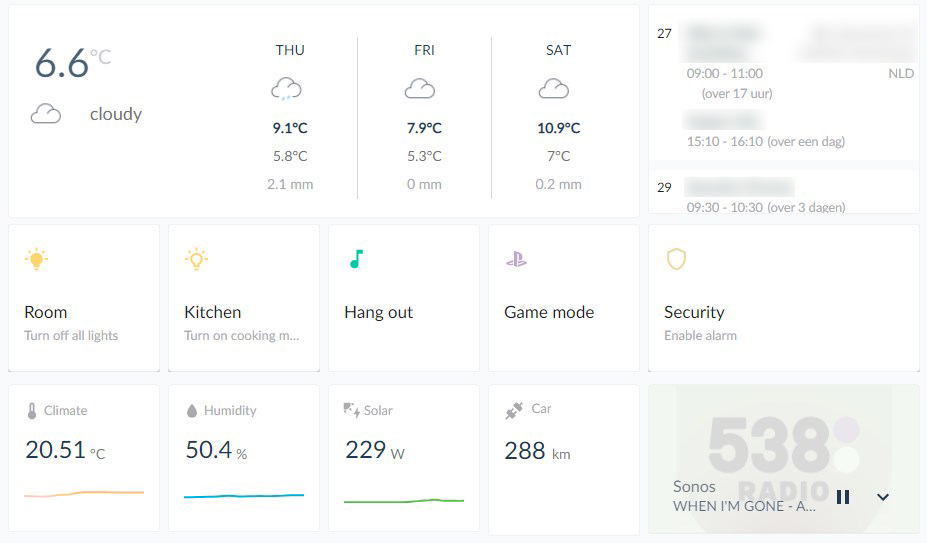
If you have added the templates and configured the fonts then you should see a result similar to this:
Switching button states
Now as you might notice, the state of the kitchen lights is on, but the icon doesn’t represent the on state. This is where the state switch plugin comes in. It allows you to replace cards based on the state of an entity.
The normal card button is also capable of showing different icons based on the state of the entity, but my buttons need to trigger a different entity (switch) on Homey. So I not only needed to change the layout of the button, but also the functionality.
I have replaced the type of custom-button card with custom:state-switch. For the entity, you will need to use an entity on which you want to change the state. In this case a group of lights.
    cards:
    # Simple button
    - type: custom:state-switch # Set the card to custom:state-switch type
      entity: light.lampen_woonkamer  # Entity to base state on
      default: off
      view_layout:
        grid-column: 1
        grid-row: 2
      states:
        "on": # When the state of the entity light.lampen_woonkamer = on
          # BUTTON WHEN LIGHTS ARE ON
          type: 'custom:button-card'  # Show our custom button card
          template:
          - base
          - quick-action
          entity: switch.lampen_uit_knop  # entity to trigger
          name: Room
          icon:  mdi:lightbulb-on # Icon
          show_state: true
          show_header_toggle: false
          state_display: "Turn off all lights"  # I like to display the action of the button
          styles: # Some custom styling
            icon:
            - color: rgb(255,213,113)
            style: |
                .button-card-main{
                    height:148px !important;
                    border: 1px solid rgba(0, 0, 0, 0.05);
                }
                #icon {
                    width: 25px !important;
                    margin-right: 8px;
                    margin-top: -20px;
                }
                #container{
                    margin: -10px 0;
                }
        "off":  # When the state of the entity light.lampen_woonkamer = off
          # BUTTON WHEN LIGHTS ARE OFF
          type: 'custom:button-card'
          template:
          - base
          - quick-action
          entity: switch.lampen_aan_knop
          name: Room
          icon:  mdi:lightbulb-outline
          show_state: true
          show_header_toggle: false
          state_display: "Turn on all lights"
          styles:
            icon:
            - color: rgb(255,213,113)
            style: |
                .button-card-main{
                    height: 148px !important;
                    border: 1px solid rgba(0, 0, 0, 0.05);
                }
                #icon {
                    width: 25px !important;
                    margin-right: 8px;
                    margin-top: -20px;
                }
                #container{
                    margin: -10px 0;
                }
This state switch is pretty straightforward. If the state of the entity light.lampen_woonkamer is on, display the first button (# BUTTON WHEN LIGHTS ARE ON). Otherwise, display the other custom button card.
Entities are not always on or off, sometimes you want to change the button based on a value of an entity. To achieve this, we can use a state template for this:
    cards:
    # Simple button
    - type: custom:state-switch # Set the card to custom:state-switch type
      entity: template
      template: >
         {% if state_attr('light.ks_6', 'brightness') != None %}
           {% if state_attr('light.ks_6', 'brightness') > 45 %}
             cooking
           {% else %}
             dimmed
           {% endif %}
         {% else %}
           turnedOff
         {% endif %}
       states:
         "cooking":
           # Add your button card here
Home Assistant is using Jinja2 templating engine, which can be a bit hard to figure out. A good way to test your templates is to use the Developer Tools in Home Assistant. Open the developer tools (left menu, just above get settings icon) and select the Template tab.
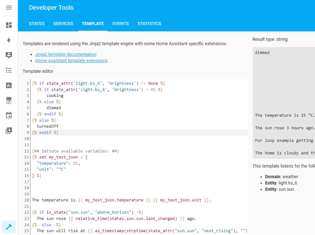
Here you can try out your templates and see the results on the right side of the screen (in the grey area)
Creating Chart Cards
On the bottom row of the dashboard, I have 3 charts. These charts give some information about the house, like the temperature, humidity, and solar panels.
To create the charts we are going to use the mini graph chart plugin for Home Assistant. Again, download it through HACS.
        # Humidity
        - type: 'custom:mini-graph-card'  # mini graph card type
          name: Humidity
          icon: 'mdi:water'
          entities:
            - entity: sensor.tado_humidity  # Entity to display
              show_legend: false
              show_state: true
              show_fill: false # Set fill to false for line chart
          show_state: true
          show_header_toggle: true
          view_layout:  # position on the grid
            grid-column: 2
            grid-row: 3
          hours_to_show: 12  # Show only last 12 hours
          points_per_hour: 2 # Show 2 data points per hour
          line_width: 8 # line thickness
          height: 140 # height of the chart
          animate: true # animate on reload of the screen
          upper_bound: 80 # Set upper limit of the chart (height possible value)
          lower_bound: 40 # Set lower limit of the cart
          align_icon: left
          align_header: left
          color_thresholds:  # Colors of the line, based on the value
            - value: 50
              color: "#00B4DB"
            - value: 70
              color: "#0083B0"
          show:
            labels: false
          style: |  # Styling of the card
            ha-card, :host{
                font-family: "LatoWeb";
                background-color: rgba(255, 255, 255, 1) !important;
            }
            ha-card{
                border: 1px solid rgba(0, 0, 0, 0.05) !important;
                border-radius: 3px !important;
                box-shadow: none !important;
                transition: width ease-in-out 0.5s,height ease-in-out 0.5s,border ease-in-out 0.2s,transform ease-in-out 0.2s !important;
            }
            .name > span {
                color: rgb(170,171,175);
                font-weight: 400 !important;
                font-size: 13px !important;
                font-family: "LatoWeb";
                opacity: 1 !important;
                width: 100px !important;
            }
            .icon {
                margin-right: 0px !important;
                color: rgb(170,171,175) !important;
                margin-left: -5px !important;
            }
            .header.flex .icon {
                --mdc-icon-size: 20px;
              }
            .states{
                font-size: 16px !important;
                font-weight: 400;
                color: #213953;
                font-family: "LatoWeb"
            }
            .state__value{
                font-size: 24px !important;
                font-weight: 400;
                color: #213953;
                font-family: "LatoWeb"
            }
            .state__uom{
                color: rgb(117,125,135) !important;
                font-size: 14px !important;
                font-family: "LatoWeb";
                opacity: 1 !important;
            }
            .graph {
                padding: 0 15px !important;
                margin-top: -10px !important;
            }
A couple of settings that are important to display nice graphs is the timeline, amount of data points, and limits:
hours_to_show: 12
points_per_hour: 2
line_width: 8
height: 140
upper_bound: 80
lower_bound: 40
For temperature or humidity, a 12-hour timeline is maybe perfect with two points per hour. But for solar, you might want to use more points per hour.
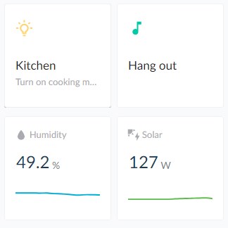
Also, the upper and lower bounds really help with displaying a nice consistent graph. Take solar panels for example. One day you might generate 4000w at max, but the other day only 500w.

With upper limit 
without upper limit
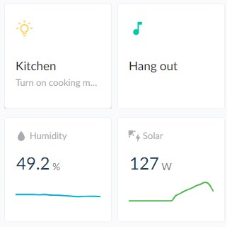
As you can see, without limits, it just looks like we hit the maximum performance today.
Media Player
For the media player, I have first connected Sonos directly to Home Assistant. Simply go to configuration > integrations and add your Sonos (or other media player) to HA.
The media player card is pretty straightforward, add Sonos system as an entity and in my case, I have set the artwork to Cover.
- type: 'custom:mini-media-player'
          noPadding: true
          entity: media_player.sonos  # Your media player entity (Sonos in my case)
          artwork: cover # Display artwork, cover the whole card
          icon: mdi:play
          view_layout: # Position on the grid
            grid-column: 5
            grid-row: 3
          hide:  # Hide what we don't need
            icon: true
            volume: true
            power: true
            prev: true
            next: true
            source: false
            controls: false
            mute: false
          style: |
            :host{
                font-family: "LatoWeb";
                background-color: rgba(255, 255, 255, 1) !important;
                --mini-media-player-base-color: #213953;
                --mini-media-player-overlay-base-color: #213953;
                --mini-media-player-overlay-accent-color: #213953;
            }
            ha-card{
                height: 100%;
                padding: 15px;
                border: 1px solid rgba(0, 0, 0, 0.05) !important;
                border-radius: 3px !important;
                box-shadow: none !important;
                transition: width ease-in-out 0.5s,height ease-in-out 0.5s,border ease-in-out 0.2s,transform ease-in-out 0.2s !important;
            }
            .ratio {
                padding-bottom: 70%!important;
            }
            .title-controls {
                width: 100%;
                height: 100%;
            }
            ha-card.--has-artwork .cover{
                opacity: 0.3 !important; # Change the artwork opacity
                filter: grayscale(80%);  # Change the artwork color
            }
            ha-icon-button{
                color: #333 !important;
            }
            .mmp__bg{
                -webkit-filter: invert(1);
                filter: invert(1);
            }
            .entity__info__name{
                color: rgb(117,125,135) !important;
                font-weight: 400 !important;
                font-size: 16px !important;
            }
The only change that I made is adding a custom style to blend in the artwork a bit more with the layout of the dashboard. By turning it to 80% grayscale and an opacity of 0.3.
Weather Card
With the bottom rows completed, we are now going to start with the biggest item on the home assistant dashboard, the weather card.
For this, I have modified the Weather Card plugin and used icons created by Lai Ming. You can download the custom icons and modified plugin here from my GitHub.
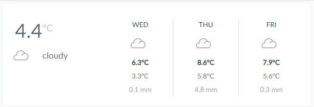
First, install the Weather Card plugin through HACS and then upload the files from my Github repository to the /www/community/weather-card folder in your Home Assistant installation.
I am using the Meteorologisk institutt (Met.no) integration to pull the weather data. But you can also use OpenWeather Map or DarkSky API. Just read the installation guide of the plugin.
        #
        # Weather card
        #
        - type: custom:weather-card
          entity: weather.home # Weather entity
          icons: "/local/community/weather-card/icons/"  # load custom icons
          current: true  # Show current weather
          details: false
          forecast: true
          hourly_forecast: false
          number_of_forecasts: 3 # 3 days for case
          view_layout:
            grid-column: 1 / 5  # Span over the 4 colums
            grid-row: 1
          style: |  # Custom styling
            ha-card, :host{
                font-family: "LatoWeb";
                background-color: rgba(255, 255, 255, 1) !important;
            }
            ha-card{
                border: 1px solid rgba(0, 0, 0, 0.05) !important;
                border-radius: 3px !important;
                box-shadow: none !important;
                transition: width ease-in-out 0.5s,height ease-in-out 0.5s,border ease-in-out 0.2s,transform ease-in-out 0.2s !important;
                grid-template-columns: 1fr 2fr;
                grid-template-rows: 1fr;
                display: grid;
            }
            .current{
                width: 200px;
                margin-bottom: 0 !important;
                grid-template-columns: 1fr 1fr 1fr;
                grid-template-rows: 50px 30px 30px;
                display: grid;
            }
            .current .icon.bigger, .current .temp, .current .tempc {
                position: inherit;
            }
            .currentWeather{
                font-size: 18px !important;
                grid-column-start: 2;
                grid-column-end: 2;
                grid-row-start: 2;
                margin-top: 15px;
                color: rgb(114,114,114);
                text-align: left;
            }
             .current .temp {
                color: #213953;;
                font-size: 40px;
                grid-column-start: 1;
                grid-row-start: 1;
                justify-self: right;
                margin-top: 15px;
                opacity: 0.8
            }
            .current .tempc {
                color: rgb(170,171,175);
                opacity: 0.6;
                font-size: 20px;
                grid-column-start: 2;
                justify-self: left;
                grid-row-start: 1;
                margin-top: 8px !important;
            }
            .current .icon{
                grid-column-start: 1;
                grid-column-end: 3;
                grid-row-start: 2;
                width: 50px !important;
                height: 50px !important;
                margin-top: 0px !important;
                text-indent: 0 !important;

                text-align: right;
                line-height: 50px;
            }
            .forecast .highTemp{
                color: #213953;
            }
            .forecast .precipitation{
                color: rgb(170,171,175);
            }
            .forecast .dayname{
                color: #213953;
            }
Adding a calendar to the dashboard
The last element (card) that we are going to add is the calendar. For this, we are going to use the Atomic Calendar Revive plugin. You will need to have Google Calendar connected to your Home Assistant installation. To do this you can follow this official guide from HA.
I have added some custom styling to the calendar card and made the scrollbar hidden. So you can scroll through the upcoming events, without showing the scrollbar.
        #
        # Upcoming Events
        #
        - type: custom:atomic-calendar-revive
          entities:
          - entity: calendar.family  # Calendar name in Google
            titleColor: #213953;
            maxEventCount: 5  # Show max 5 events
          language: nl
          europeanDate: true
          noEventsForNextDaysText: Geen afspraken komende dagen
          noEventsForTodayText: Geen afspraken vandaag
          untilText: tot
          fullDayEventText: Hele dag
          refreshInterval: 300
          dateFormat: LL
          locationLinkColor: rgb(170,171,175);
          showProgressBar: false
          view_layout:  # Position on the grid
            grid-column: 5 / 6
            grid-row: 1
          style: |
            ::-webkit-scrollbar {
                display: none;  # Remove the scrollbar
            }
            ha-card, :host{
                font-family: "LatoWeb";
                background-color: rgba(255, 255, 255, 1) !important;
            }
            ha-card{
                border: 1px solid rgba(0, 0, 0, 0.05) !important;
                border-radius: 3px !important;
                box-shadow: none !important;
                transition: width ease-in-out 0.5s,height ease-in-out 0.5s,border ease-in-out 0.2s,transform ease-in-out 0.2s !important;
            }
            .event-titleRunning {
                color: #213953;
            }
            .cal-card {
                padding: 0;
            }
            .cal-eventContainer{
                padding-top: 15px !important;
            }
            .event-title{
                color: #213953;
            }
            .daywrap {
                border-top: 10px solid rgb(248,250,251);
            }
            .hoursHTML, .relativeTime{
                color: rgb(170,171,175);
            }
Kiosk Mode
The last step is to remove the header and sidebar from Home Assistant when viewing the dashboard on the tablet. For this, we are using the Kiosk mode plugin. After you have installed the plugin, simply add the following code in your ui-lovelace.yaml, just above the views.
kiosk_mode:
  mobile_settings:
    hide_header: true
    hide_sidebar: true
    ignore_entity_settings: true
    custom_width: 1320 # Set this to the max width (or slightly higher) then the width of your tablet

# Views
We only want to remove the header and sidebar on the tablet. So we only apply it on mobile devices, with a screen size below 1320px.
Wrapping Up
Creating your own custom dashboard in Home Assistant can be quite challenging. There is a lot of information and tips on the HA community forums, but most assume you already have some knowledge of HA.
I hope this article helped you with creating your own dashboard in Home Assistant, if you have any questions, just drop a comment below.


Does show_header_toggle: false really need to be in there?
Checkout this topic on the HA forum : https://community.home-assistant.io/t/wth-is-show-header-toggle-true-by-default/225720
Hello,
I want help for a project which I have. Can you send me ean email to discuss it further?
I want to build a mediaplayer to control shell_command as a volume slider and sources are switches wich i send nc commands to the remote Device.
I want the player because then i have to create from the ESPHome with esp8266,oled screen and Rotary Encoder a Menu to Control these entities. They told me from the community that with media player will be easier to control it From ESPHome. But i’m new at HA and i’m tryning very much to finish this project.
I would be grateful if someone could help me!!
I need help on creating a smarthome dashboard
What kind of help?
This is great. Thanks a lot. Been using the default Lovelace generated UI and this finally helped me getting a nice looking dashboard.
But I’m now a bit confused. How do Themes play into this? I noticed that the night mode for example does not work on this dashboard. Is there anything that needs to be considered?
This is just a custom dashboard, indeed without night mode.
Just a quick thanks for this. I finally figured out how to use custom fonts in dashboard themes in large part thanks to your post.
He,
I really like this dashboard. Its simple and wife friendly! 🙂
One thing I can’t figure out is the state-switch card. Its more squished together than like the normal light card.
Can you help me out?
Mail me a screenshot of the issue, please. I think it’s related to a styling issue.
Where can I find the following file ‘latofonts.css’?
You can crap it here: https://github.com/ruudmens/LazyAdmin/tree/master/Home%20Assistant/www